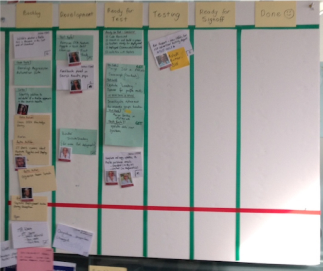
When forming your new Agile team, one of the many decisions to make is how to set up your Story Wall. You can try lots of variations – including different columns, techniques, and/or approaches. But how do you decide? Here are some ideas to get you started.*
Common story wall design aspects
- What columns to choose from
- What to use rows for
- What are avatars and how can they be used on a Story Wall?
- How coloured Story Cards can represent different types of work
- What are the benefits and differences of Physical vs Electronic Walls?
1. What columns to choose from?
With Story Walls, there’s no end of columns you can use. However, most walls start with the very basics, such as:
- To do
- Doing
- Done.
This might be enough for your Story Wall, as long as everyone understands the definition of “Done” – that is, what criteria needs to be met before the Story Card can be claimed as Done.
I’ve found teams generally need a level of maturity to regularly communicate to each other a Story Card’s status. They often don’t need a Column as a visual indicator that highlights this. However, some teams prefer to add in more columns to visually indicate Story Card status. So below is a list of columns I’ve seen and an attempted definition for each:
| Column name | Also known as | Definition |
Product Backlog |
Product Backlog |
A waiting place for cards the Product Manager (or customers) would like for the Product and haven’t yet been started, or cards that may not have been prioritised.These will need to be prioritised before determining which Iteration they fit into or whether they are actually required. |
Iteration Backlog |
Sprint Backlong, To Do |
Where cards that have been prioritised for the current Iteration, but not yet started, wait. |
Analysis |
In Analysis |
Where cards move when requirements and acceptance criteria are being identified, elicited, and documented.Some teams may agree to have the analysis done upfront before the card moves to the Backlog. |
Development |
Dev, In Dev, In Development, In Progress |
Where cards move when a project is being built based on the agreed acceptance criteria.This may include code level testing (i.e. unit testing, test driven development), depending on team agreement and company standards. |
Testing |
Test, In Test, In Testing, In QA, QA, In Verification, Verification |
Where cards move when Development is completed and ready to be checked against acceptance criteria. This aspect could be automated or done manually.Other testing may occur here, including exploratory, performance, and accessibility testing. |
Signoff |
In Signoff, Business Acceptance Testing (BAT), In BAT, User Acceptance Testing (UAT), in UAT |
Where cards move when Development and Testing has passed the agreed acceptance criteria. The team will then seek approval that the card meets the expectations of the Business Representative or Product Manager. |
Done |
Closed |
Where cards move when they’ve been approved and meet the team’s definition of Done.This may or may not include deployment to Production, which would also depend on the team’s definition of Done. |
Ready for Analysis / Dev / Testing / Signoff |
Ready for “insert also known as name here” |
Where cards move when they’re ready for each stage. Team members can pull the work from these columns when they are ready, as opposed to work being pushed to them from someone else. |
Deployed |
In Production |
Where cards move when they’ve been deployed into Production. Some teams may move cards to Done before deploying to Production (perhaps to come up with a batch size to deploy to Production and release to the public).If work is constantly been pushed to Production but is not yet live, an alternative would be to use this column to highlight launched work. One way to do this is via Feature Toggles. |
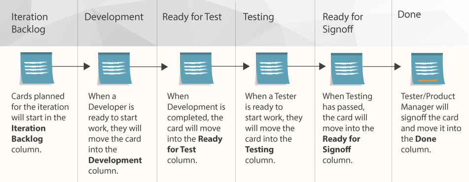
Using some of the columns explained above, I thought it might also be useful to visualise below how Story Cards would flow through a Story Wall. However, there is more to Story Walls than just columns.
Story Wall process diagram
2. What to use rows for?
Story Walls allow you to have columns representing work status at any given time, but you can also use rows. These are sometimes referred to as Swimlanes and I’ve seen two different approaches for their use:
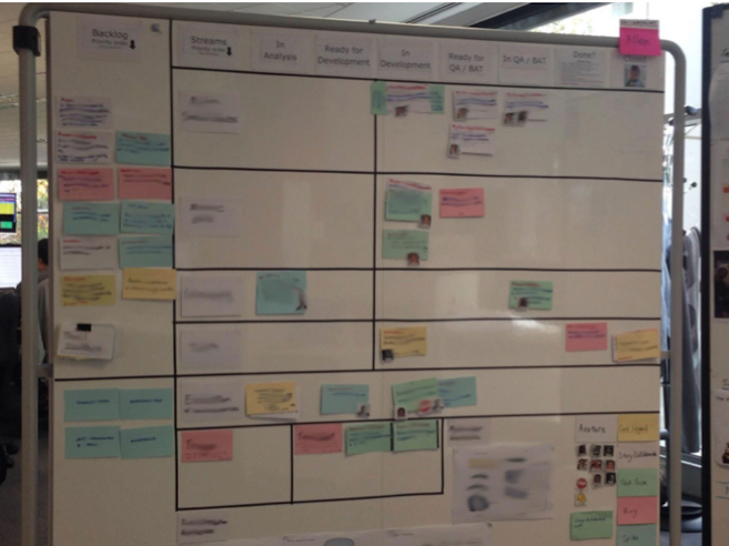
- Representing different Feature groupings or Streams. This lets you visualise splits in team focus (i.e. half your team could be focusing on Reporting while the other half focuses on Credit Card Payments).
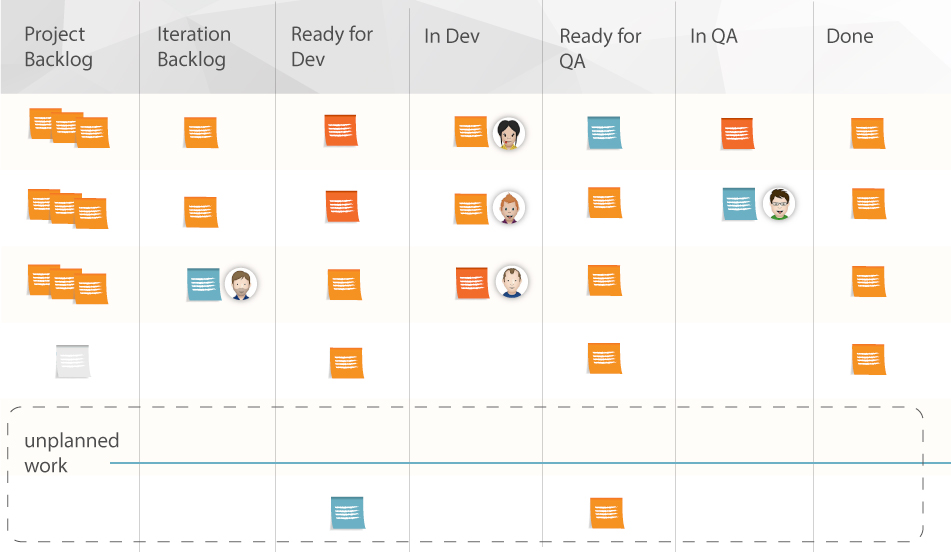
- Representing different statuses. Here you can visualise variations from the norm (i.e. Cards that are Blocked can not be progressed until action is taken. Unplanned cards are those your team didn’t originally agree to working on for the Iteration).
Example of a Story Wall split by Streams
Examples of Story Walls with rows to highlight status.

What are avatars and how can they be used on a story wall?
Avatars are primarily used to identify who’s currently working on a Story Card. You can see them in action above. From experience, I’ve found it works best to design these types of Avatars with the following attributes:
- A real picture of the team member (a face can be “photoshopped” onto someone/something, but the idea is to be able to easily recognise who it is)
- The first name of the team member in a bold, readable font
- An avatar sized in proportion to the Story Card size (i.e. the avatar doesn’t take up too much space on the Story Card, but is still distinguishable).
Some team members can be a bit hesitant about having their photo on the Story Wall, or just want to have a bit of fun and pick a theme. This can work as well, as long as their name is on the avatar. Personally, I prefer having a real picture but the bottom line is whatever you use has to be accepted by the entire team.
Below are examples I’ve used in the past. On one particular project, we had a lot of fun designing our avatars. Our faces were photoshopped onto the same famous Australian media person who ended up being our team mascot. The crazy things you come up with on projects! Can you guess who it is?
Avatars can also be used to highlight a Story Card’s status – the most common being the Blocker avatar. However, your team can use avatars flexibly to represent whatever status they feel is appropriate for a Story Card.
4. How coloured story cards can represent different types of work
OK, you’ve decided on the structure of your Story Wall. Now you can consider whether you want to use different colours to represent different types of Story Cards.
The most common colours are: Red, Blue, Green, Yellow, and White (generally because everyone orders their Story Cards from the same stationary company). While you’re free to use whatever colours you want, I’d still like to provide some suggestions (and there’s an example below as well):
- White = Story Card. A new piece of functionality for the software being developed
- Red = Bug. A defect identified against a Story Card or the software
- Green = Technical Task. A technical piece of work that isn’t new functionality for the software but will assist you to add new functionality
- Blue = Spike. A timeboxed piece of investigation to work out how new functionality or technical work could be implemented. These results will generally lead to Story Card/s or Technical Task/s being created.
- Yellow = Retrospective Action. An action item from one of the team’s Retrospectives
Example of a Story Wall with different coloured Story Cards
You could even add a Legend or a Key next to your Story Wall so everyone understands what each card represents. But this raises another point – should you use a physical or electronic board?
5. Physical v Electronic story walls
Before considering how you set up your Story Wall, you’ll need to decide whether to have a physical or electronic wall (i.e JIRA, Trello, RallyDev, etc.).
I always recommend a physical wall (I learned this the hard way from a failed attempt at only using an electronic wall for a co-located team). However, rather than making a sweeping statement without proper evidence, I’d like to back this up by providing a summary of the pros and cons for each alternative.
Note: Another consideration is whether you have a co-located team or distributed team. I’ll add comments on this for both.
| Physical Wall | Electronic Wall | ||
| Pro | Con | Pro | Con |
Lo-tech – Just need Cards, pens, bluetack, wall |
Restricted to one location – Wall can not be seen from other locations (i.e. distributed teams) |
Detailed – Can document as much detail as needed |
Hi-tech – Requires large monitor to make the board visible to the team |
Tangible – Can touch it/ see people moving cards / rip up cards |
Duplication updating wall – If used in parallel with an electronic board |
Accessible from anywhere! – Different cities/countries |
Limited space – Restricted by monitor size |
Easily visible – Anyone walking by can see the Story Wall |
No arts and crafts required |
Limited flexibility – Can only do what the electronic tool can do |
|
Very flexible – No limitation on what can be designed for the wall |
Less visible – As all details are stored within a system, it’s less visible than having all the cards out in the open on a physical Story Wall |
||
You might have noticed I’ve alluded to the possibility to having a dual physical and electronic wall. I’ve used this for both co-located and distributed teams.
Co-located teams that want benefits that come with an electronic wall (i.e. detailed documentation), I’d suggest configuring it to store documentation without the need to update which column a Story Card is in. Your physical wall can then be the primary source of project truth.
Distributed teams might be best served by duplicating their Story Wall in both physical and electronic formats. I believe the benefits of having a tangible board backed up by an electronic wall far outweigh the cons of duplicating effort across both boards.
This does mean you get all the benefits and negatives of both approaches, but I’ve found it helps people to understand and know how Story Cards are progressing. This option requires a bit of diligence from the team to keep the two Story Walls in sync, however, it ensures everyone is always on the same page.
Story wall summary
As you can see, there’s a lot to consider for your Story Wall. I think the best approach is to decide what options will work best for your team’s needs.
Most importantly, whether you try some or all of the elements I’ve suggested or go with your own ideas, give it a go. If you find something isn’t working, don’t be afraid to change how your wall works. In my latest team, we altered our Story Wall multiple times over the course of six months. We didn’t want to be stuck in a process we had defined if it wasn’t working for us. So, pick out what you think you’ll need as a team and try it out!
More resources:
There are a number of other resources out there with great suggestions on how to set up your Story Wall. Here’s a short list to take a look at:
- One pager explaining the purpose and benefits of Story Walls
- Short video explaining the purpose and benefits of Story Walls
- Article explaining various walls, including Story Walls, commonly found in Agile
- Great site for getting lots of different ideas for your Story Walls
- Great presentation from Agile Australia 2013 where Craig Smith and Renee Troughton provided tips and tricks for having a great, visual Story Wall
* To clarify, the ideas I’m suggesting here are predominantly based on both XP and Kanban approaches because this is where my experience lies. For example, Scrum is somewhat different – Story Cards can be broken down into Task levels. Here I assume that Story Cards don’t need to be broken down further.

